As a practical follow up to this post on Usable, Useful, & Desirable Design, I’m sharing the process of how I created a visualization to complement the writing. This is not only about visualization but the use of AI in the process and how I benefited from it. A lot.
Here are a couple of the draft visuals I created in Figma in about 15 minutes. Simple drafts to help validate the concept.

The pyramid worked for the hierarchy I wanted to convey, but packing the text in wasn’t great.

The Venn diagram does a better job of visual balance and possibly asserts the notion that this actually isn’t a hierarchical principle.
I decided to go to Claude and ask about visualizations. I provided my original article first. Then asked the following question:

Claude rejected the idea of hierarchy, even though it still chose a pyramid as an option. I used the honeycomb for the design thinking guidelines and it worked well in that context, but this concept didn’t have that complexity. I was going for simplicity and reduction. The last couple of suggestions were adding even more unneeded complexity to something I wanted to be simple.
Claude’s use of the word “spectra” caught my attention. I think this is really the essence of concept: that these elements are parts of a spectrum and perhaps this was the way to look at it.
I read the last line, “Want me to build one?” Why yes, Claude, yes I do.
You can see I was still pushing the hierarchical approach.

The reponse was still a bit off but we were still getting somewhere.
Claude asked at the end, “Want me to go ahead and build one of these as interactive visualizations?”
I told Claude, “Yes, go nuts.” Claude went nuts.
Here’s what it came up with:
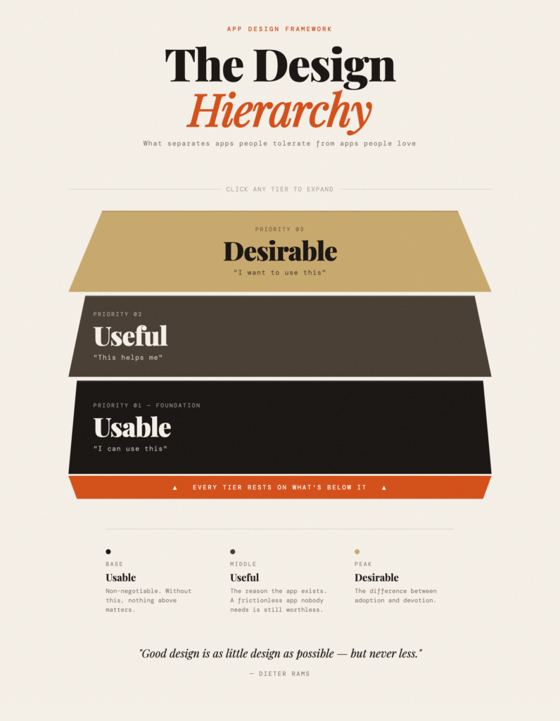
But it wasn’t just a static image, it created an impressive, interactive html poster.
I’ve been using AI tools to supplement my work for a few years now. The boost to my productivity and creativity has certainly enhanced my abilities. For the moment AI tools in my field are not yet irreplaceable, as designers are not replaceable and I don’t see them as such for the near term.
Yet Claude’s massive, superhuman processing ability gave me something in about 90 seconds that would have taken me hours to create. Yes, it was flawed in several ways:
- The type styles, sizes, and legibility were flawed.
- The supplemental text improvised by Claude strayed from my objectives, although some were great takes that show a foundational understanding of my intent.
- It missed considerably the Web Content Accessibility Guidelines (WCAG) standards.
Still, Claude made some fairly accurate estimates of what I wanted. I’d say it even helped on a greater scale with direction. Claude was sensing my ambivalence about the hierarcy and provided a visual that was stacked but not necessarily in favor of one or the other. This was a smart move.
Even thought my AI partner was confidently incorrect to some degree, it handled the tasks with the understanding of a college design student, although probably first-year, as opposed to a novice helper.
I told Claude that the effort was very impressive and it might put me out of work.

The skeptic in me still wants to believe Claude will become my new overlord, but its response was assuring and articulate, even though it may have been programmed to assure me.
So I still have some work on it but I’d agree with Claude: I’m still the expert and it takes expertise to use these tools effectively. I will talk about roles between LLMs and humans in another post soon.
But first, I revised the interactive version to get it nearer to my desired goal in this one, Working as a Team of 1, With Claude AI.